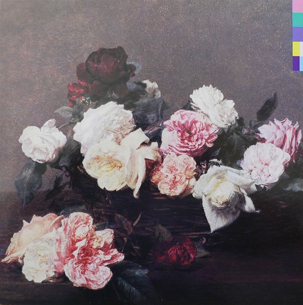
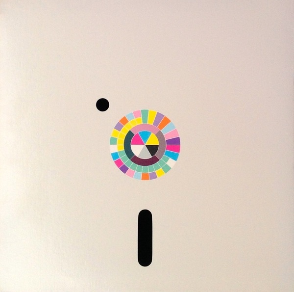
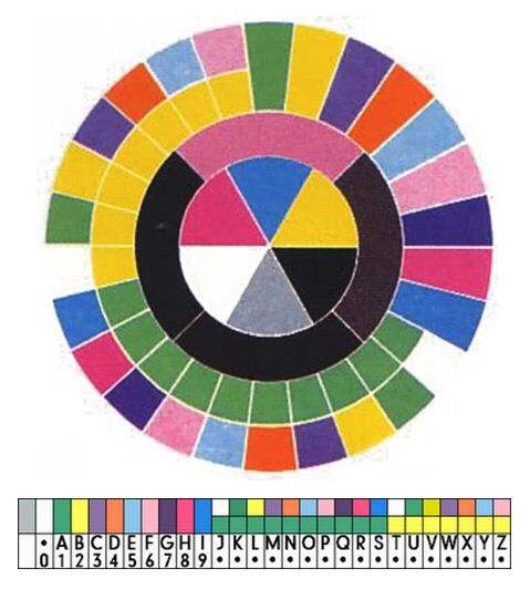
The inception of the album cover (as described by Tony Wilson):
‘I have been asking myself a question and I want the sleeve to answer the question.’
‘What’s the question, Peter?’ asked Hooky, always willing to move the conversation along and show a little more interest.
‘How many colours does it take to replace language, to replace the alphabet?’
Most people print colours by the four-colour printing process – that cyan, magenta crap. And Factory did that. But every so often Peter or one of his acolytes – for Peter had been followed by a trail of other ‘great graphic designers on the way up’ – asked for a special colour. Which meant the printers did the four-colour run and then added one, two or more runs for these ‘special colours’. ‘Cause Factory’s designers did not trust the cyans and magentas to get together specifically enough to give them the exact bloody shade that their vision demanded. And since the music was great, then the packaging in which the customer received said art would have to have the same attention to perfection.
It cost more, to cut it short. And Peter’s intriguing question was bound to cost more. The explanation was almost mundane compared to the preceding analysis of cost, process and attitude. With ten colours representing digits zero to nine, you could make numbers one to twenty-six and reflect a Western European alphabet. So that was that, they’d have this bloody picture of a bunch of flowers and some colour coding instead of lettering. Sounded good. No one complained. No one ever did. Peter was good. That was enough.
• New Order – Blue Monday
More on the art of New Order here:
